300x600
GARDEN OFFICE-LINK BETWEEN INSIDE AND OUTSIDESTUDIO LAGOM
That homes are often echoes of the owner’s personality and lifestyle is a well-known fact. But the genesis of the design for this office for a real-estate developer, too, lay in the promoter’s taste, preferences and personality.

As the office was to be created in a building developed by the firm, there was freedom and control over the internal configuration of the penthouse level where it is located. So, in effect, the architect was presented with a shell, and a set of requirements from the client: a main (owner) cabin that had to have a formal area and an informal lounge; connections between levels; links between inside and outside; and integration of greenery into the internal environment.
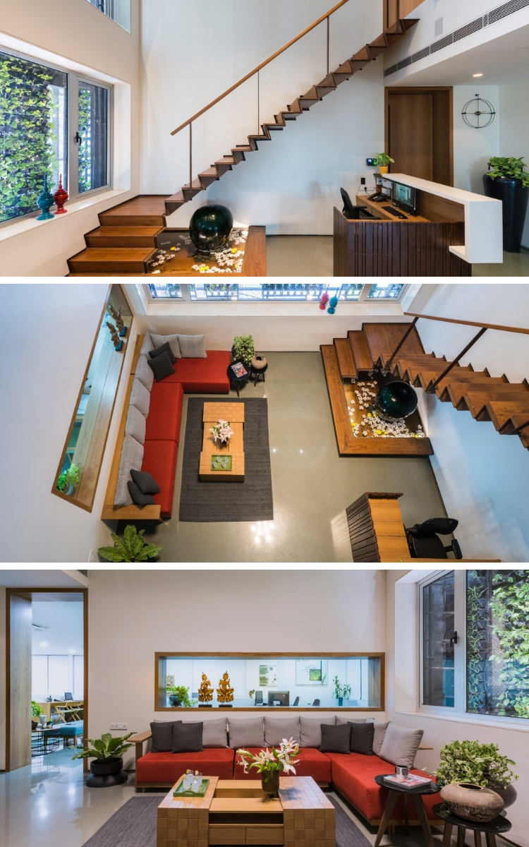

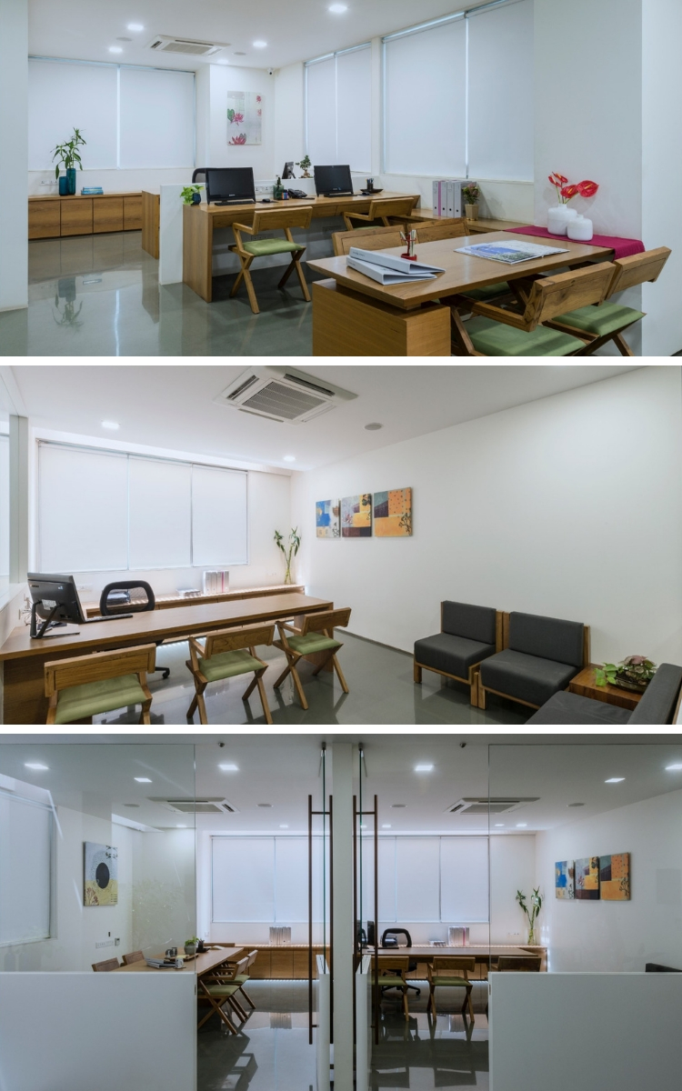
The architect viewed the space as a plot and sketched out a double-height reception that would connect both levels, and an owner’s cabin that spilled over into a partially double-heighted west-facing terrace with beautiful sunsets. Within the remaining space, on the lower level, was created an essentially open-plan office, with the requisite cabins, especially one reserved for the accountant/manager – a sensitive post – overlooking the reception, the main entrance, and the general office area. On the upper level, is a suite of rooms that function as a guesthouse.
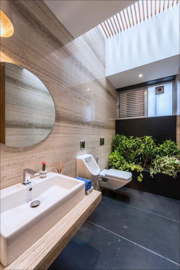
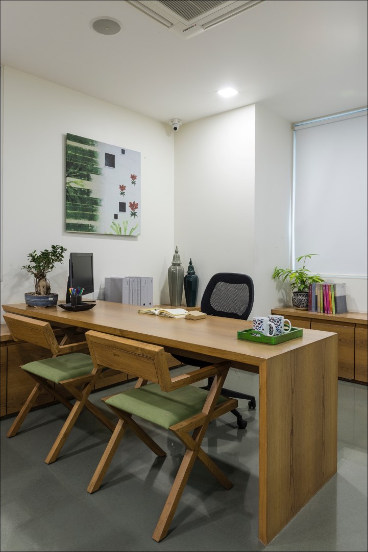
The material and colour palette is unostentatious and demure, referring to the simple and humble personality of the owner: timber and veneer, weathered steel and mirror-polished grey Kota and Kadappastones (both varieties of limestone) teamed with pastel soft furnishings.
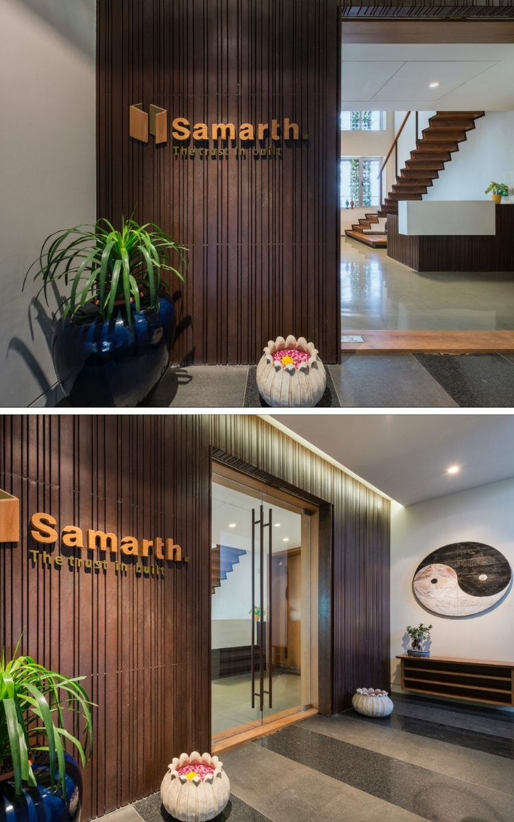
The entrance façade presents solidity through its use of hollow sections of mild steel of varying widths. The material spills into the reception lounge via the reception desk and the staircase that climbs to the next level. It is rendered as a single folded metal plate entity, centrally clad with wood to create a carpet-like effect. At its base, is a waterbody; it’s a gentle sound of water imbues the space with serene overtones.
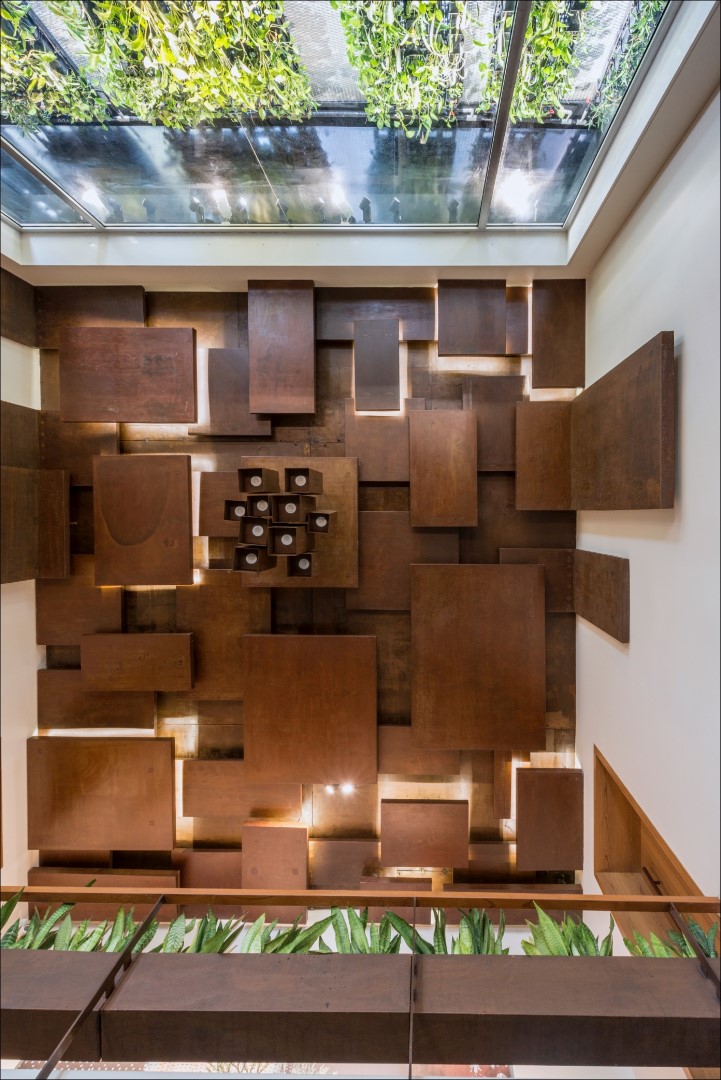
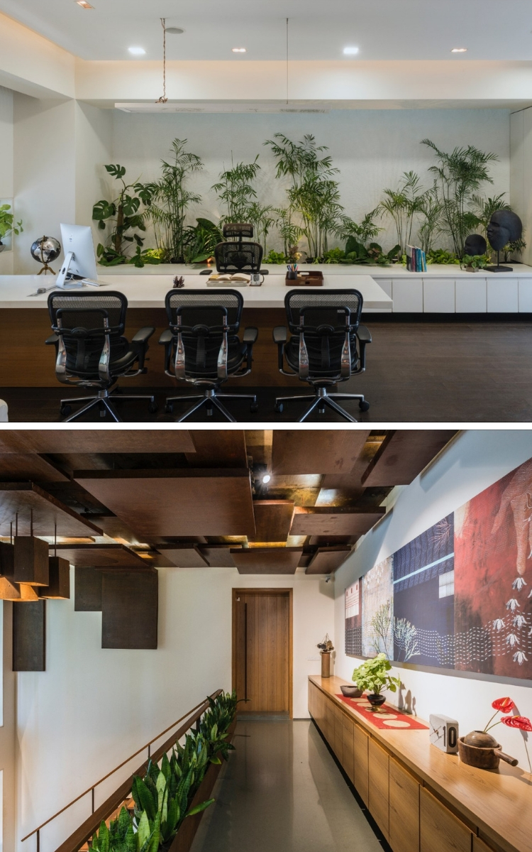
The reception lounge sees a strong interpretation of the inside-outside connect with its 24’ vertical garden accommodated in a building duct. The greenery presents a strong counterpoint to the metal, creating a taut balance between the animate and inanimate; organic and the inorganic. The motif of the random bands (seen first in the entrance façade) is repeated in the grey lattice bands that separate the green walls. Besides the lush vertical garden, another design highlight of the reception is the customized chandelier that uses the ceiling and a part of the wall as its canvas. The installation, which features an overlapping collage of weathered steel quadrangles of varying dimensions and heights, has concealed lighting for added effect.
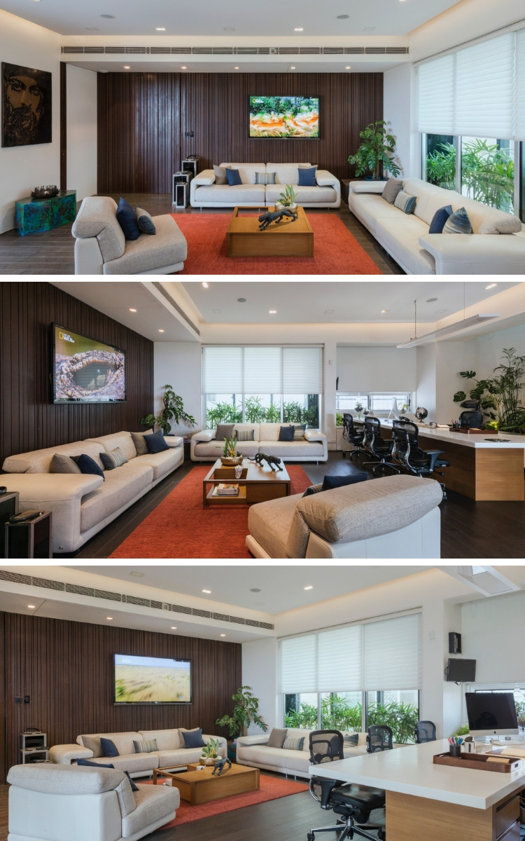
The master cabin, which was elevated as a token of respect to the position of the occupant, gets together an eclectic material palette of engineered wood, mild steel, and Corian. The entry door is cleverly concealed within a wall lined with hollow MS sections of random widths. A counterpoint to the metal is an internal garden – the link between the inside-outside again – that basks in natural light from the skylight. The cabin spills over into the terrace, a lounge-like break-out space reveling in sunlight and greenery.
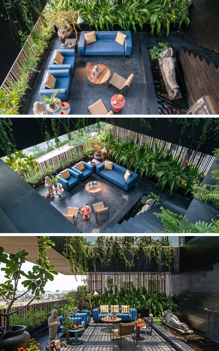
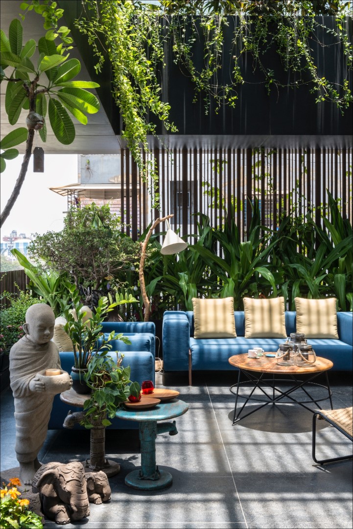
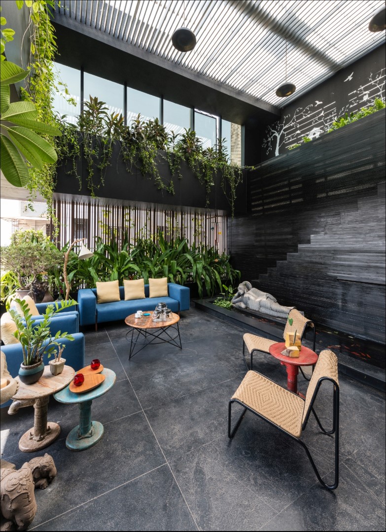
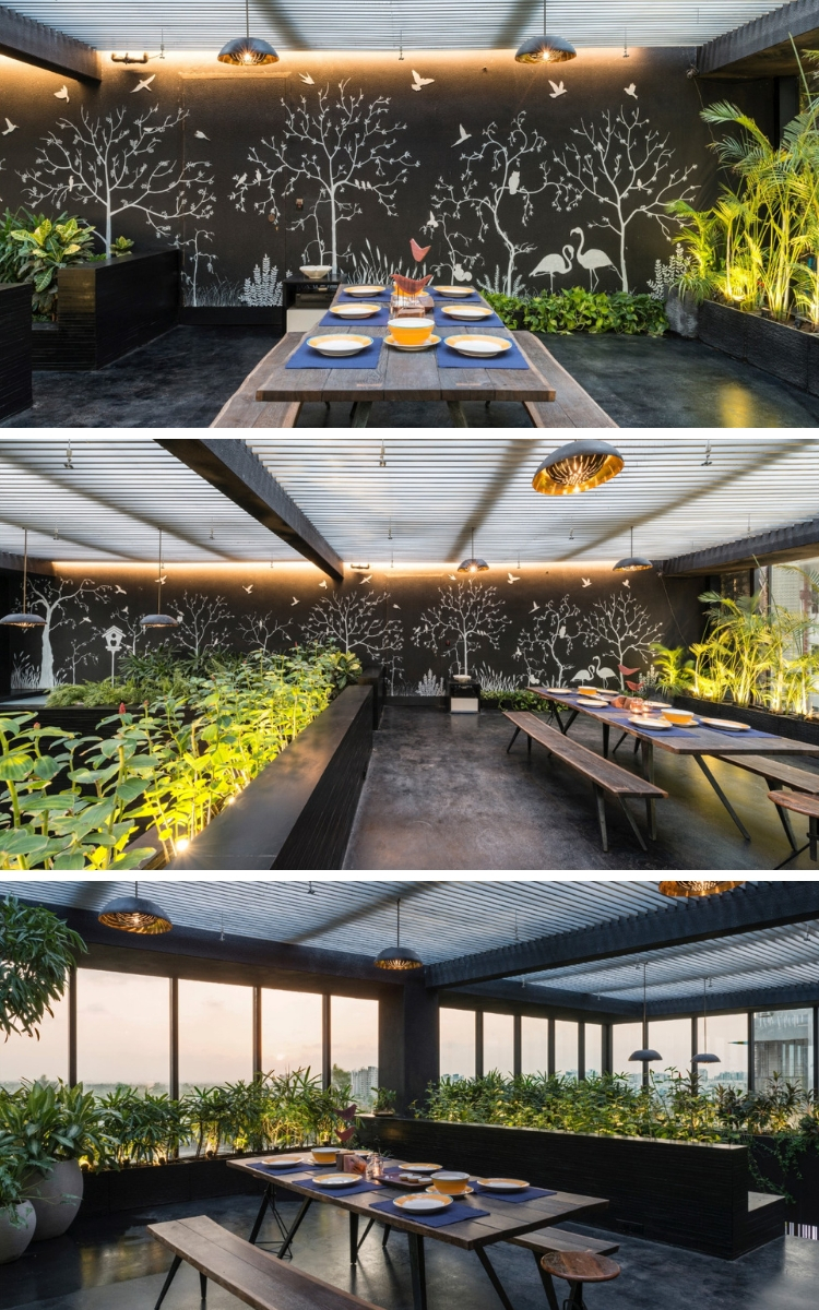
Here, MS slats work as a screen that erases the neighboring structures from sight and, as a shorter version, function as a railing for this double-height space. The kadappa on the floor climbs up the wall to create patchwork-like cladding, with a cascade and a koi pond at the base. Up the stairs is a formal meeting room, a cocoon-like space wrapped in black leather-finish kadappa and black paint. One large 40’ x 10’ wall has been turned into a canvas for the silhouette of a sylvan setting. This, along with greenery, animates the closed area and adds visual depth.
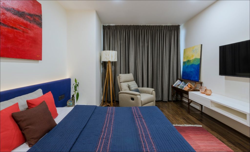
Housed on the upper level, the executive staff area comprises an informal seating lounge, guest room, and conference room. This functions as a guesthouse for visiting consultants and is also pressed into service for presentations and for recouping energies between long-drawn meetings. Soothing and serene, its simple elegance is heightened by greenery that is bathed in sunlight that pours in through several skylights.
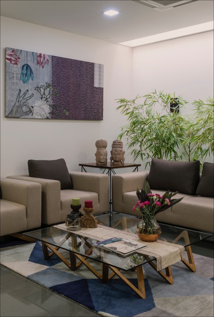
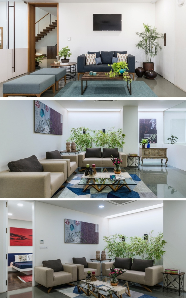
This office eschews from chest-thumping, pretentious design statements, and relies on simplicity, comfort, and nature to create an effective workspace.

0 Komentar